Best Website Design for Therapists: 10 Outstanding Examples for 2026

Therapist Web Design Example

Your therapy website is often the first place potential clients meet you. And in those first few seconds, they’re making critical decisions: Do I feel safe here? Does this therapist get what I’m going through? Can they actually help me?

If your website doesn’t answer those questions clearly, or if it looks like every other therapy site out there, you’ve lost them. They’re hitting the back button and moving on to the next Google result.

We’ve developed 250+ therapy websites for counsellors, psychologists, and group practices across North America. We’ve analyzed hundreds of therapist websites, studied what converts, and built sites that actually grow practices.

For this post, we reviewed hundreds of therapy website designs and handpicked 10 of the best therapist websites of 2026. These aren’t just beautiful websites. They’re strategic, client-focused, and built to convert visitors into booked sessions. Each one excels at messaging, design, user experience, and conversion strategy.

Whether you’re launching your first solo practice or scaling a group clinic with a dozen therapists, these therapy website examples will show you what great website design for therapists actually looks like. We’ll break down what makes each site work, what you can learn from them, and how to apply these strategies to your own counseling website.

What Makes a Great Therapy Website?

Before we dive into our top therapist website examples, here’s what we evaluated. The best therapy websites of 2026 share these characteristics:
Great therapy website design isn’t about following trends or using the fanciest features. It’s about creating a clear path from “I need help” to “I’m booking a session.” The best counseling websites make that journey as smooth and reassuring as possible. Now let’s look at 10 outstanding therapist website examples that got it right.

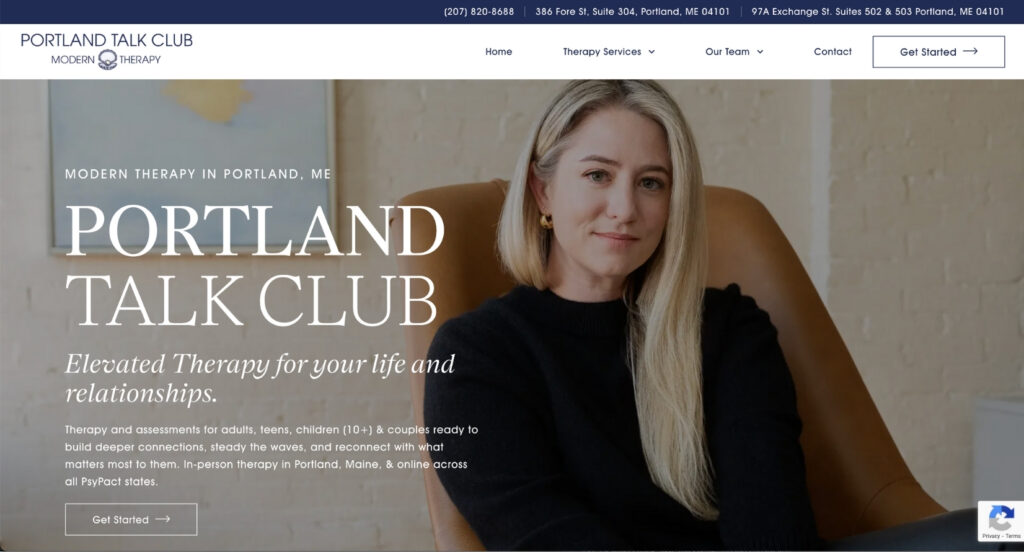
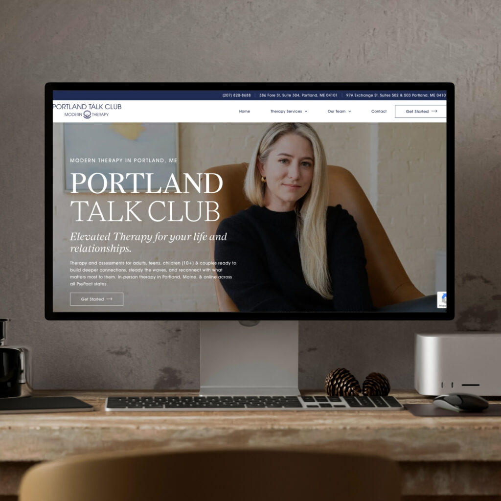
1. Portland Talk Club: Best Therapist Website Example for Boutique Positioning

What Makes This Therapy Website Design Stand Out

The Portland Talk Club website is what happens when you stop trying to look like every other therapy practice and actually commit to a brand. This is one of the best therapist websites we’ve seen for boutique positioning. From the second you land on their homepage, you know exactly who they are, who they serve, and what makes them different.

What Makes This One of the Best Counseling Websites

Custom Photography That Matches Their Brand

Here’s the thing: most therapy websites rely on stock photos of people looking thoughtfully out of windows or holding coffee mugs. Portland Talk Club said “no thanks” and invested in custom photography that reflects their space, their vibe, and their people. This therapy website design choice makes the site feel real, warm, and totally aligned with who they are. You’re not looking at generic therapy office #47. You’re looking at their therapy office.

They Leaned Into the Coastal Thing (And It Works)

Portland, Maine has a whole vibe, and they didn’t shy away from it. The nautical, coastal aesthetic isn’t just pretty. It speaks directly to their target audience in a way that creates instant connection. The design feels sophisticated but approachable, modern but not sterile. It’s very intentionally “Portland” without hitting you over the head with lobster imagery. This is smart therapy website design that uses location as a competitive advantage.

SEO That Doesn't Sound Like a Robot Wrote It

We can’t tell you how many therapy websites we’ve seen where the copy is so stuffed with keywords it’s painful to read. Portland Talk Club weaved SEO naturally into their messaging. They’re ranking for the right terms, but actual humans still want to read their website. That’s the sweet spot for great therapist websites.

Homepage FAQ Section

By answering common questions right on the homepage, they’re doing two things at once: helping Google understand what they do (which boosts SEO), and removing friction for visitors who need quick answers before they’re ready to reach out. People want to know if you take their insurance, if you offer virtual sessions, what your availability looks like. The best therapy website designs answer those questions upfront and watch contact form submissions go up.

They're Actively Recruiting (Smart Move)

As they grow, they built out a “Join Our Team” page that highlights what makes their clinic a great place to work. This is strategic. Instead of scrambling to find therapists when they need them, they’re proactively attracting the right people. If you’re planning to grow your counseling practice, this is how you do it.

Google Maps on the Contact Page

Their contact page includes an embedded Google Business map. This does three things: makes it stupidly easy for clients to find them, boosts their local SEO, and shows off all those five-star reviews they’ve worked hard to earn. It’s a small touch that makes a big difference in therapy website design.

Boutique Language Throughout

The copy feels elevated without being pretentious. They’ve positioned themselves as a premium option, and the language reflects that. This isn’t your insurance-mill therapy practice. This is somewhere people actually want to be. The best therapist websites understand positioning matters as much as design.

Key Takeaway from This Therapy Website Design

If you want your practice to stand out in a sea of sameness, invest in custom photography and commit to a real brand identity. Generic doesn’t convert. Portland Talk Club proves that when your website actually reflects who you are and where you are, people feel it. And they book. This is what outstanding therapy website design looks like. If you want your practice to stand out in a sea of sameness, invest in custom photography and commit to a real brand identity. Generic doesn’t convert. Portland Talk Club proves that when your website actually reflects who you are and where you are, people feel it. And they book. This is what outstanding therapy website design looks like.

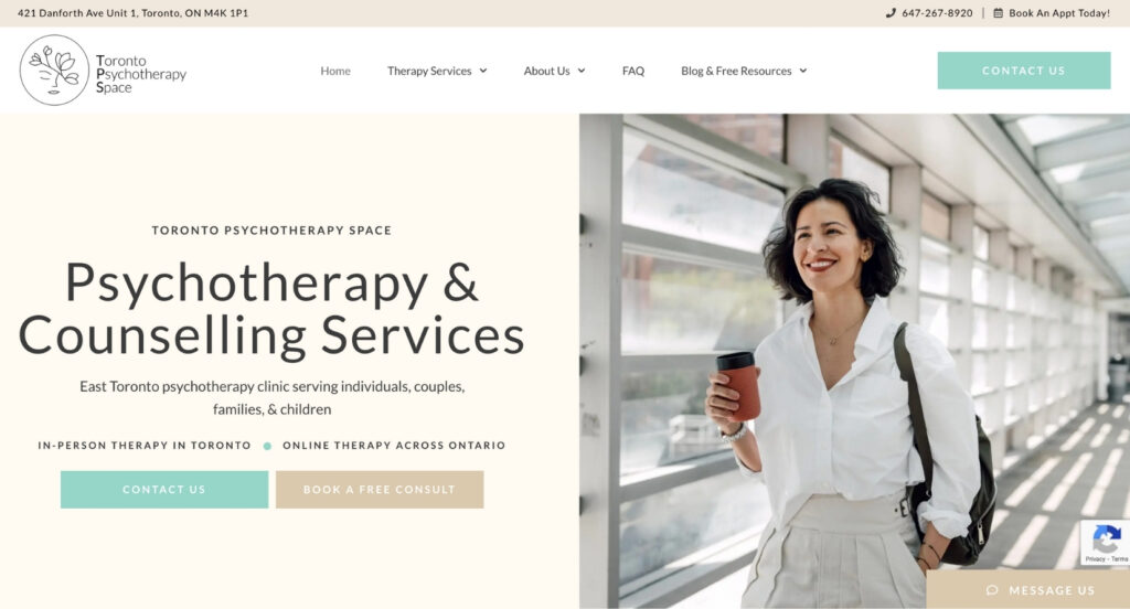
2. Toronto Psychotherapy Space: Best Therapist Website for Large Group Practices

What Makes This One of the Best Therapy Websites

Toronto Psychotherapy Space is proof that a large practice doesn’t have to feel overwhelming or confusing. This therapy website design is expansive (we’re talking a LOT of pages and services), but it never loses clarity. That’s incredibly hard to pull off, and they nailed it. This is one of the best counseling website examples we’ve seen for practices with 10+ therapists.

What Makes This Therapy Website Design Work

The Slider Strategy Is Genius

Most homepage sliders are annoying. They rotate through different headlines and images, which usually just confuses people. Toronto Psychotherapy Space did something smarter: they keep the text static on the left side while rotating through photos of different people. The message stays consistent (“Here’s what we do”), but the imagery shows the diversity of their client base. It’s subtle, effective, and doesn’t give you decision fatigue. This is smart website design for therapists with diverse clientele.

Free 20-Minute Consult Front and Center

They lead with their free consultation offer right at the top of the homepage. For people who are nervous about therapy (which is most people), this removes a huge barrier. You’re not committing to anything. You’re just having a conversation. That’s a much easier ask, and it gets more people in the door. The best therapist websites understand how to reduce friction in the decision-making process.

They Built Landing Pages for Specific Conditions

This is where a lot of practices drop the ball. Toronto Psychotherapy Space has individual pages for depression therapy, trauma and PTSD therapy, parenting support, and more. Each page is optimized for the exact search terms people are typing into Google (“depression therapy Toronto,” “PTSD counselling near me”). This makes them rankable for dozens of different search queries instead of just one generic “therapy in Toronto” page. It also means they can run highly targeted Google Ads that send people to the exact service they’re searching for. That’s how you grow a counselling practice through your website. This is essential therapy website design strategy for SEO.

Therapist Filter System (Essential for Large Teams)

When you have 15+ therapists on your team, the “scroll through everyone’s bio” approach doesn’t work. People get overwhelmed. Toronto Psychotherapy Space added a filter that lets visitors narrow down therapists by specialty, availability, and approach. This is a gamechanger for therapy website design. It helps clients find their fit faster and cuts down on the “who should I see?” emails flooding the admin inbox. The best therapist websites make matching easy.

The Uniform Headshot Hack

Here’s a problem every growing practice faces: getting consistent headshots when half your team works remotely. Coordinating photoshoots is a nightmare. Their solution? Take whatever headshots therapists already have, remove the backgrounds, and place them on the same neutral backdrop. Boom. Instant visual consistency without the logistical headache. It’s simple, scalable, and it works. This is practical therapy website design that solves real problems.

Direct Booking Links from Therapist Bios

When someone clicks “Book Online” from a therapist’s bio, they go directly into that specific therapist’s Jane booking calendar. No extra clicks. No “choose your therapist” dropdown. Just straight to booking. Every extra click is a chance for someone to bounce. Toronto Psychotherapy Space removes those clicks and makes it ridiculously easy to book. The best counseling websites minimize friction at every conversion point.

FAQ Page That Actually Helps

Instead of cramming every possible question onto one giant FAQ page (which nobody reads), they focused on the most common objections: billing and insurance. It’s short, scannable, and actually useful. If you’re trying to answer every question someone might have, you’re overwhelming them. Focus on the objections that stop people from booking, and answer those. This is strategic therapy website design.

"Learn More" Buttons Everywhere

Because the site is so expansive, they’ve added “Learn More” buttons throughout. This lets people go as deep as they want without forcing information on them. If you just want to know they offer couples therapy, great. If you want to read three pages about their approach to couples therapy, you can do that too. It’s a choose-your-own-adventure setup that works for different types of visitors. Great website design for therapists accommodates different information needs.

Key Takeaway from This Counselling Website Design

If you’re running a large practice, your therapy website needs systems that help people self-navigate. Filters, direct booking links, and condition-specific landing pages aren’t just nice to have. They’re essential. Toronto Psychotherapy Space shows you can be big without being confusing. You just have to be intentional about how you organize everything. This is what the best therapy websites for group practices look like.

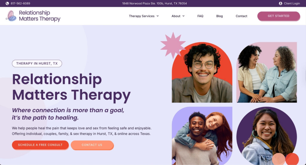
3. Relationship Matters Therapy Clinic: Best Therapy Website Design for Energy and Personality

Why This Is One of the Best Therapist Websites for Branding

If therapy websites had a personality contest, Relationship Matters would win. This site brings serious energy while still feeling professional and trustworthy. It’s proof that you don’t have to choose between “fun” and “credible.” You can be both. This is one of the best counselling website examples we’ve seen for injecting personality without sacrificing professionalism.

What This Therapy Website Design Gets Right

Fun Without Being Unprofessional

The colour palette here is bold. We’re talking vibrant, energetic colours that make you want to keep scrolling. But here’s the magic: it never tips into looking unprofessional or chaotic. The design strikes that perfect balance where you feel like “these people get it” without questioning whether they’re actually qualified therapists. That balance is hard to nail in therapy website design, and they did it.

Shapes and Visual Interest Everywhere

Throughout the site, you’ll see fun geometric shapes integrated into the design. It keeps things visually interesting and makes sure this site doesn’t look like it came from a template (because let’s be honest, a lot of therapy websites do). Every page feels intentional and custom, which builds trust before someone even reads a word. The best therapist websites use design elements to communicate quality.

They Highlight Their Niche Specialties

Sure, they cover the basics, but they also call out some less commonly supported areas that make them stand out. When you specialize in things that other practices don’t advertise, you become the obvious choice for people looking for exactly that. It’s smart positioning in counselling website design.

Diversity Is Visible, Not Just Claimed

A lot of therapy websites say “we’re inclusive” and then show you stock photos of one demographic. Relationship Matters actually shows the diversity they serve in their imagery. It’s not performative. It’s just real representation, and it makes a huge difference for visitors trying to figure out if this practice is for them. Great therapy website design backs up claims with visuals.

"How to Get Started" Section Is Crystal Clear

They laid out a simple 1-2-3 process for getting started. No mystery. No “contact us and we’ll figure it out.” Just: here’s step one, here’s step two, here’s step three. When you remove confusion, you remove friction. When you remove friction, more people take action. The best counselling websites make the path forward obvious.

Short Contact Form (Yes, This Matters in Therapy Website Design)

Their contact form asks for the bare minimum: name, email, phone, and a quick message. That’s it. Compare that to forms that ask for your entire life story, insurance details, referral source, preferred appointment times, and your childhood pet’s name. Long forms kill conversions. Short forms get filled out. Relationship Matters gets it.

Blog with Built-In Conversion

They maintain an active blog (great for SEO), but here’s the genius part: the contact form is embedded right there on the blog page. So if someone lands on a blog post from Google, reads about managing anxiety or improving communication in relationships, and thinks “okay I need help with this,” they can reach out immediately without navigating away. Most therapy blogs drive traffic but don’t convert because there’s no clear next step. Relationship Matters fixed that. This is strategic therapy website design.

What We Can Learn from This Therapy Website

Don’t be afraid of bold design choices. Therapy doesn’t have to look beige and boring. Relationship Matters proves that when you bring energy and personality to your website, you attract the right people. And when you make getting started stupidly simple, more of those people actually book. This is what outstanding website design for therapists looks like when you embrace personality.

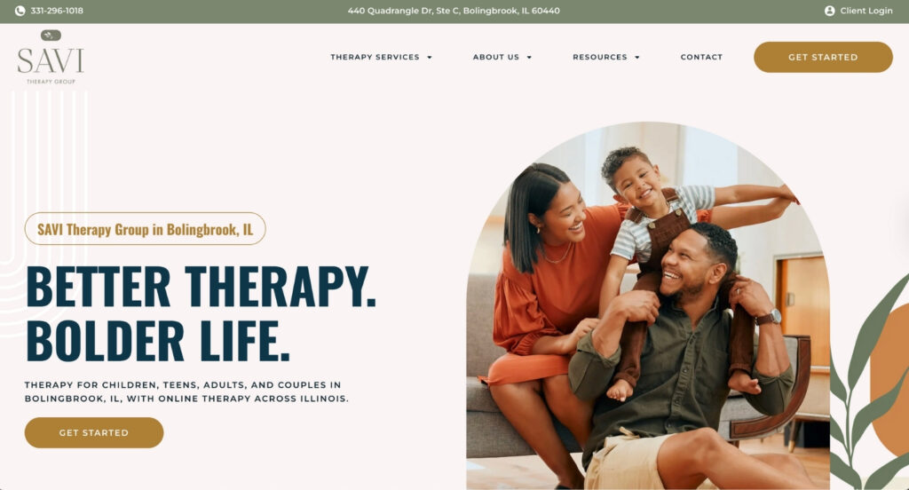
4. Savi Therapy Group: Best Therapist Website for Premium Positioning

Why This Is One of the Best Therapy Websites for High-End Branding

Savi Therapy Group’s website feels expensive in the best way. This is premium positioning done right. Every design choice, every image, every line of copy feels intentional and elevated. If you want to see what a high-end therapy brand looks like, this is it. This is one of the best counselling website examples we’ve seen for practices positioning themselves at the premium end of the market.

What Makes This Therapy Website Design Stand Out

Boho Brand Identity (And They Commit to It)

They chose a boho aesthetic and went all in. The colour palette, the imagery, the fonts, the design elements are all perfectly aligned. There’s no “well we kind of like boho but also modern minimalist and maybe a little corporate?” happening here. They made a choice and stuck with it, which creates a cohesive, memorable brand. The best therapist websites commit to a clear identity instead of trying to be everything to everyone.

Brand Colours Extend to the Photography

This is next-level therapy website design. They didn’t just pick brand colours for their logo and buttons. They actually selected and edited photography to match their colour palette. When you scroll through the site, everything feels like it belongs together. It’s not just a collection of random images. It’s a curated visual experience that reinforces their brand at every turn. This is what separates good counselling websites from great ones.

Custom Brand Photography

Like Portland Talk Club, they invested in custom photography that shows their actual space. This isn’t “generic therapy office with plants.” This is their space, which gives potential clients a real sense of what it would be like to work with them. That transparency builds trust. The best therapy websites show, don’t just tell.

Arches as a Recurring Design Element

Throughout the site, you’ll see arch shapes showing up in different ways. It’s subtle but effective. As you move from page to page, there’s a visual thread that ties everything together. It makes the site feel cohesive instead of like a bunch of disconnected pages slapped together. This attention to detail is what makes exceptional therapy website design.

Insurance Networks Upfront

Right at the top of the homepage, they list the insurance networks they’re in-network with. This is brilliant website design for therapists. For people whose #1 question is “do you take my insurance?”, the answer is immediate. No digging through an FAQ, no calling to ask, no email back-and-forth. Just instant clarity, which removes a major decision-making barrier. The best counselling websites anticipate and answer objections before they become deal-breakers.

"Join Our Team" Page for Strategic Recruiting

As they grow, they’ve built out a page specifically for therapists who might want to join them. It highlights the benefits of working at Savi and what makes their practice culture unique. If you want to attract quality team members, you need to sell them on why your practice is the place to be. Savi gets that. Smart therapy website design thinks about all audiences, not just clients.

Online Booking Isn't the Only Option

You can book online if you want, but you can also call or use the contact form. Different people have different preferences for how they want to start the therapy process. By offering multiple pathways, they’re not losing people who aren’t ready to commit to an online booking yet. Great counselling website design accommodates different decision-making styles.

What Other Therapist Websites Can Learn from This Design

If you want to position as a premium practice, your therapy website needs to look premium. That means cohesive branding, custom photography, layered design elements, and a colour palette that shows up everywhere. Savi Therapy Group shows that when you invest in high-quality design, you’re not just making things pretty. You’re signaling value and building trust. This is what the best therapy websites for premium positioning look like.

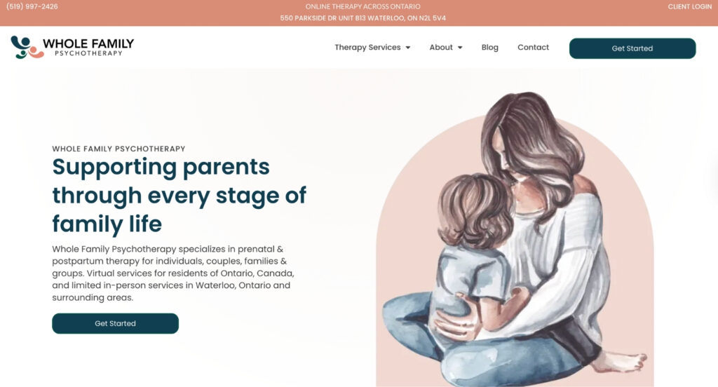
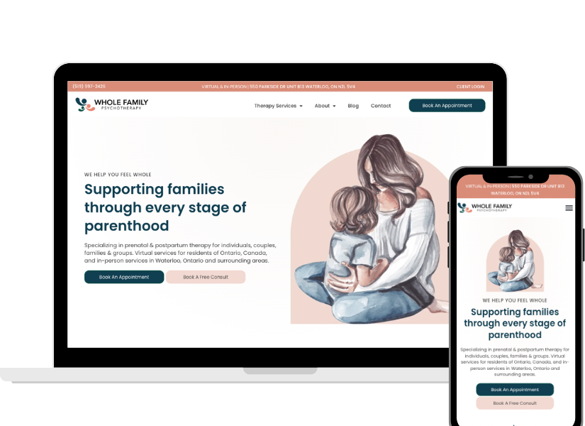
5. Whole Family Psychotherapy: Best Therapist Website for Niche Positioning

Why This Is One of the Best Counselling Websites for Specialized Practices

Whole Family Psychotherapy is what happens when you actually understand your niche and design everything around them. Their focus is perinatal mental health (new parents, expecting parents, postpartum support), and you can tell from the second you land on their site. This is one of the best therapy website examples we’ve seen for practices that serve a specific population. Everything from the colours to the copy to the imagery is tailored to their audience.

What This Therapy Website Design Gets Right

On-Brand Illustrations That Match Their Niche

They use illustrations throughout the site that feel warm, welcoming, and perfectly suited to their perinatal focus. The visuals immediately communicate “this is a safe space for parents.” It’s not generic therapy imagery. It’s specifically designed for the people they serve. The best therapist websites use visuals strategically to communicate specialization.

Fun Branding Without Losing Professionalism

The colour palette is bright and energetic without feeling childish. It’s playful but still professional. That’s a hard balance when you’re targeting parents (who want warmth and approachability) but also need to be taken seriously as mental health professionals. This therapy website design nails that balance.

Photography Shows Outcomes, Not Struggles

Here’s a mistake we see constantly on therapy websites: photos of people looking sad, anxious, or distressed. Whole Family Psychotherapy flipped that. Their photos show happy families, connected couples, and parents who are thriving. They’re selling the outcome, not the problem. That’s way more motivating for someone considering therapy. The best counselling websites focus on the transformation, not the struggle.

Specific Focus Areas on the Homepage

Instead of vague “we help with stress and life transitions” language, they get specific: postpartum anxiety, birth trauma, relationship strain after having a baby, parenting stress. When you name the exact struggles your ideal clients are facing, they feel seen. And when people feel seen, they book. The best therapist websites speak directly to specific pain points.

Video Bios on Therapist Pages

This is HUGE for therapy website design. Each therapist has a video on their bio page where they introduce themselves and talk about who they work with. Therapist-client fit is everything in therapy, and these videos let potential clients get a real sense of each person’s personality and style before booking. It’s like a mini consultation before the actual consultation, and it dramatically increases the chances that the person who books will actually be a good fit. The best counselling websites use video to build connection.

Specialty Pages for SEO and Ads

They built out individual pages for specific specialties (postpartum depression, anxiety during pregnancy, couples counselling for new parents, etc.). Each page is optimized for search and makes for a perfect landing page if they ever run Google Ads. This is how you rank for multiple search terms instead of just one generic “therapy” keyword. This is essential therapy website design strategy for visibility.

Therapist Carousel with Uniform Backgrounds

They feature their therapists in a carousel on the homepage, and all the photos have consistent backgrounds. This creates visual cohesion and makes the team feel like a team, not a random collection of individual contractors. It’s a small detail that makes a big difference in counselling website design.

Key Takeaway from This Counselling Website

When you deeply understand your niche, you can design everything to speak directly to them. Whole Family Psychotherapy doesn’t try to be everything to everyone. They focus on perinatal mental health, and every single element of their therapy website reinforces that focus. That clarity is what makes them stand out and what makes people choose them over generalist practices. This is what the best therapy websites for niche practices look like.

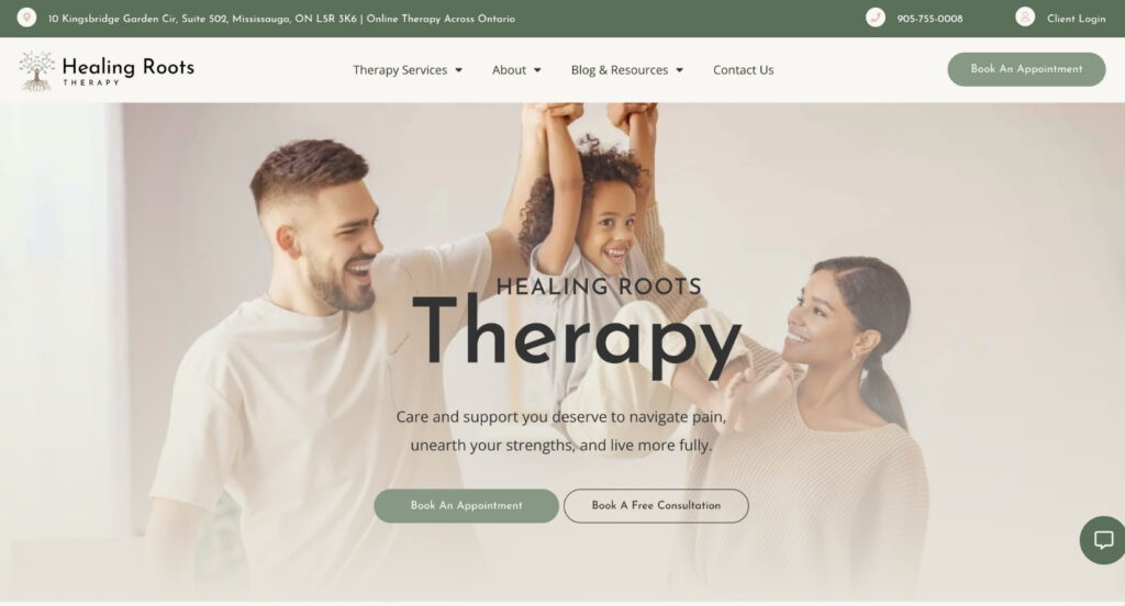
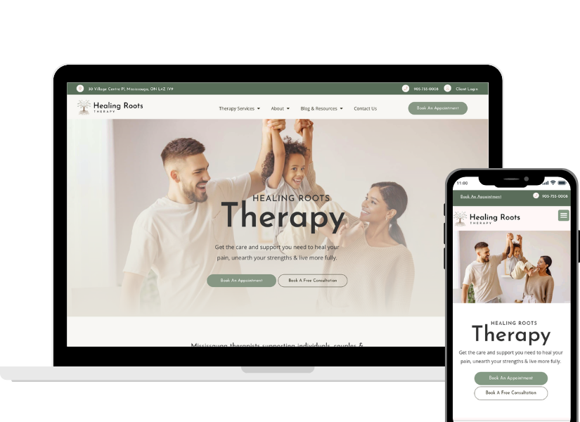
6. Healing Roots Therapy: Best Therapy Website Design for Large Group Practices

Why This Is One of the Best Counselling Websites for Scaling Practices

Healing Roots Therapy is a large group practice that’s cracked the code on something most big clinics struggle with: how do you help visitors find the right therapist when you have 15+ people on your team? Their site makes it easy, which is exactly what you need when you’re operating at scale. This is one of the best therapy website examples we’ve seen for practices managing growth without sacrificing user experience.

What This Therapy Website Design Gets Right

Featured Program Front and Center

They offer an ADHD assessment and treatment program, and they highlight it prominently on the homepage and in the navigation. When you have a specialty program, don’t bury it. Feature it. It’s a differentiator that makes you the obvious choice for people specifically looking for ADHD support. The best therapist websites showcase what makes them unique.

Intro Video Showcasing the Space

There’s a welcoming video on the homepage that gives you a virtual tour of their clinic. The space is bright, modern, and beautifully designed. For people who are nervous about therapy (which is most people), seeing the actual space removes some of that mystery and anxiety. It’s not a dark, clinical office. It’s somewhere you’d actually want to be. Smart therapy website design reduces anxiety before the first appointment.

Instagram Integration (Because They Actually Post)

They embedded their Instagram feed on the homepage. Here’s the key: they only did this because they’re consistent about posting. If your Instagram hasn’t been updated in six months, do not put it on your therapy website. But if you’re active and sharing valuable content, it’s a great way to show personality and build connection. The best counselling websites only showcase social media they’re actually maintaining.

Therapist Filter System (Essential for Large Teams)

This is the feature that makes everything work on this therapy website. They have a filter on their team page that lets visitors search by specialty, approach, availability, and other criteria. Instead of scrolling through 20 therapist bios hoping to find someone who works with anxiety and accepts your insurance, you just filter and boom, here are your matches. This is a must-have for any counselling website with more than 5-6 therapists.

Available Therapists Shown First

If a therapist isn’t accepting new clients, they automatically get moved to the bottom of the list. So when someone visits the team page, they see available therapists first. This is smart UX because it prevents people from getting excited about someone who can’t actually take them on. The best therapist websites prioritize available options.

Clickable Phone Number

On mobile (where most people browse therapy websites), the phone number is clickable. One tap and you’re calling. This seems obvious but you’d be surprised how many counselling websites don’t do this. The best therapy websites optimize for mobile behaviour.

Detailed Contact Form (That Matches Their Size)

Because they’re a larger practice with more intake complexity, their contact form asks for a bit more information upfront. This helps them route inquiries to the right person and reduces the back-and-forth. For smaller practices, a short form works better. For larger ones, a more detailed form actually improves efficiency. Smart counselling website design matches form length to practice size.

What We Can Learn from This Therapy Website

When you’re running a large practice, your therapy website needs smart systems. Filters, availability indicators, and clear pathways help visitors self-navigate instead of getting overwhelmed. Healing Roots Therapy shows that you can be big without being confusing. You just need to design with scale in mind. This is what the best counselling websites for group practices look like.

7. J Gordon Psychology Group: Best Therapist Website for Multi-Service Practices

Why This Is One of the Best Therapy Websites for Dual-Service Models

J Gordon Psychology Group runs both a therapy practice and a psychological assessment clinic, and their website makes that dual focus crystal clear. This is how you showcase two distinct service lines without confusing people about what you actually do. This is one of the best counselling website examples we’ve seen for practices offering both therapy and assessments.

What This Therapy Website Design Gets Right

Two Clear Service Pillars

Right from the homepage and navigation, they break things into Assessments and Therapy Services. These are treated as equally important pillars of their business, not as an afterthought buried somewhere in the menu. When you offer multiple service types, this kind of clear organization is essential in therapy website design. People know immediately whether they’re in the right place.

Fun, Approachable Branding for a Clinical Service

Psychological assessments can feel intimidating. They’ve softened that with bright colours, playful icons, and imagery that makes the whole process feel less scary. It’s still professional and credible, but it’s not the sterile, clinical vibe that turns people off. This is especially smart when your client base includes teens and young adults who are already nervous about assessments. The best therapist websites balance credibility with approachability.

Welcoming Video Tour

Like a few other sites on this list of best therapy websites, they have a video on the homepage showing their clinic space. The space is bright, warm, and modern. For people considering an ADHD assessment or anxiety treatment, seeing the actual environment helps reduce that “what am I walking into?” anxiety. Smart counselling website design removes barriers before the first visit.

Team Featured on Service Pages

Instead of hiding their team on a separate page, they show relevant therapists and psychologists right on the service pages. So if you’re looking at their ADHD assessment page, you see the practitioners who actually provide that service. This builds trust and helps people start to connect with specific team members before they even book. The best therapy website designs create connection early.

Multiple Assessment-Specific Landing Pages

Here’s where they really shine from an SEO and Google Ads perspective in their counselling website design. They built individual pages for different types of assessments: ADHD assessments, learning disability assessments, autism assessments, etc. Each page is optimized for the exact search terms people are using. This means they can rank organically for multiple specific queries AND they can run highly targeted ad campaigns that send people to the exact service they’re looking for. This is marketing gold for therapy websites.

Emotion-Driven Copy on Specific Pages

Instead of just listing what’s included in an assessment, they speak to the emotional experience. What struggles are you facing? What would it feel like to finally have answers? When you connect on an emotional level, people don’t just understand what you offer. They feel understood. And that’s when they book. The best therapist websites connect emotionally, not just informationally.

Office Space Showcased on Contact Page

Their contact page features photos of their beautiful clinic space. In Edmonton’s competitive therapy market, this is a differentiator. When your space is this nice, show it off in your therapy website design. It signals quality and care.

Key Takeaway from This Therapy Website

If you offer multiple service types (like therapy and assessments), treat them as distinct pillars and build dedicated landing pages for each. J Gordon Psychology Group proves that when you create specific entry points for different services, you can rank for way more search terms and run way more effective ad campaigns. Specificity wins in therapy website design.

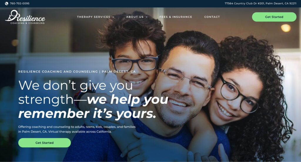
8. Resilience Counseling PD: Best Therapy Website for User Experience

Why This Is One of the Best Counselling Websites for Navigation

Resilience Counselling PD has a bold brand identity and incredibly smart UX decisions. This site is proof that when you make strategic choices about navigation and information architecture in your therapy website design, you make it way easier for people to convert. This is one of the best therapist website examples we’ve seen for intuitive user experience.

What This Therapy Website Design Gets Right

Bold Brand with a Standout CTA Colour

Their primary call-to-action button is a vibrant green that pops against the rest of the design. This isn’t an accident in this counselling website design. When your CTA is visually distinct, it’s easier for people to find it. And that green button shows up everywhere throughout the site, so no matter where someone is, they know exactly how to take the next step. The best therapy websites make conversion pathways obvious.

Sans-Serif Fonts with Clear Hierarchy

They chose clean sans-serif fonts, which are easier to read on screens (especially mobile). But the real genius is how they used bolding to create clear visual hierarchy in their therapy website design. Your eye immediately knows what’s a headline, what’s body text, and what’s important. A lot of counselling websites have walls of text that all look the same. This doesn’t.

Scrolling Insurance Banner

Right on the homepage, there’s a scrolling banner showing which insurance companies they’re in-network with. For people whose #1 question is “do you take my insurance?”, the answer is immediate. No hunting through an FAQ, no calling to ask. Just instant clarity. This single feature probably cuts their “do you take Blue Cross?” emails in half. Smart therapy website design anticipates the most common questions.

Smart Team Page Structure

Even though you can access bios from the homepage, they still have a main team page that serves as a hub. This is the right approach in therapy website design. The team page shows all the therapists at once with key differentiators (specialty, approach, availability), and then people can click into individual bios from there. This prevents navigation overwhelm while still giving people options for how they want to explore.

Logo Icon as Background Element

Throughout the site, their logo icon appears as a subtle background graphic. It’s a nice touch that reinforces brand identity without being distracting. These little details add up to create a cohesive, professional feel in therapy website design.

Clean, Polished, Easy to Navigate

The site is just… easy. You never feel lost. You never wonder where to click next. Everything is intuitive. That sounds simple, but it’s shockingly rare in therapy websites. Most counselling websites make you hunt for basic information. This one doesn’t. Great therapy website design is invisible – it just works.

Bios Linked from Navigation (But Smartly)

In the navigation menu, they don’t list every single therapist by name (which would be overwhelming in therapy website design). Instead, the dropdown says “Our Team” and takes you to the team overview page. From there, you can explore individual bios. This is way cleaner than a mega-menu with 15 therapist names.

Key Takeaway from This Counselling Website

Smart UX decisions make a huge difference in conversions. When you make information easy to find, CTAs easy to spot, and navigation intuitive, more people take action. Resilience Counselling PD shows that good therapy website design isn’t just about looking pretty. It’s about removing every possible point of friction between “I’m interested” and “I’m booking.” This is what the best therapist websites for user experience look like.

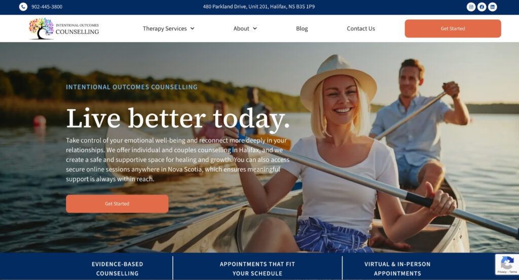
9. Intentional Outcomes: Best Therapy Website for Getting the Fundamentals Right

Why This Is One of the Best Counselling Websites for Core Execution

Intentional Outcomes is a group practice that gets the fundamentals right. They nail the essentials  actually matter for conversions: clear messaging, easy therapist selection, and multiple pathways to get started. Sometimes the basics, executed really well, are all you need in therapy website design.

What This Therapy Website Design Gets Right

Problem-Led Homepage Copy

Instead of leading with credentials or therapy modalities (which most people don’t care about yet), they lead with the problems people are facing. Anxiety keeping you up at night? Relationship feeling disconnected? Struggling after a major life change? When you name the pain points first in your counselling website copy, people feel seen. And when people feel seen, they keep reading. The best therapist websites lead with problems, not solutions.

Clear Therapist Showcase

Their therapists are prominently featured with photos and key info. You’re not hunting around wondering who works there or what they specialize in. It’s all right there, organized and easy to scan. Smart therapy website design makes team exploration effortless.

Detailed Bios with Direct Booking

Each therapist has a comprehensive bio that helps you understand their style, approach, and who they work best with. And here’s the key part: you can book directly with that specific therapist right from their bio page. No “contact us and we’ll match you with someone.” If you connect with a particular therapist’s bio, you can book with them immediately. The best counselling websites remove unnecessary steps.

Multiple Ways to Get Started

Online booking is available, but it’s not the only option. You can also call, email, or fill out a contact form. Different people have different comfort levels with online booking. Some are ready to commit. Others want to ask questions first. By offering both, they’re not losing either group. Great therapy website design accommodates different decision-making styles.

Google Business Integration

By embedding their Google Business listing on the contact page, they’re accomplishing three things: making it easy for people to find them, boosting local SEO, and showcasing their reviews. Social proof matters in therapy website design. When people see 50+ five-star reviews right on your contact page, it builds instant credibility.

Team Member Availability Indicated

On the team page, it’s clear which therapists are accepting new clients. This saves people from clicking into a bio, getting excited about someone, and then finding out they have a waitlist. That kind of disappointment can make people give up entirely. Show availability upfront in your therapy website design.

Key Takeaway from This Therapy Website

You don’t need the fanciest design or the most unique branding to have an effective therapy website. What you need is clarity, ease of navigation, and multiple conversion pathways. Intentional Outcomes nails the fundamentals, and fundamentals are what convert visitors into clients. Sometimes the basics, done really well, are all you need in counselling website design. This is what the best therapist websites for solid execution look like.

10. Therapy for Us: Best Therapist Website for Bold Inclusive Branding

Why This Is One of the Best Therapy Websites for Clear Positioning

Therapy for Us is unapologetically bold, inclusive, and personal. This website makes a statement the second you land on it. You know exactly who this practice is for, and if it’s for you, you feel it immediately. This is one of the best counselling website examples we’ve seen for practices that serve a specific community and aren’t afraid to say so.

What This Therapy Website Design Gets Right

Inclusive Positioning from Second One

From the imagery to the colour choices to the language, it’s crystal clear that this is an LGBTQ+ affirming, inclusive space. There’s no ambiguity. There’s no “we welcome everyone” buried at the bottom of the About page. It’s front and center in this therapy website design. For people in the queer community who’ve had bad experiences with therapists who claimed to be affirming but weren’t, this kind of explicit positioning is everything. The best therapist websites are clear about who they serve.

Bold Colour Palette

The colours here are vibrant and energetic. Bright blues, purples, and teals that feel modern and alive. This isn’t your neutral, beige therapy office aesthetic. It’s bold, and that boldness signals confidence and authenticity in counselling website design.

Language That Doesn't Hedge

The copy is warm, direct, and inviting. There’s no clinical jargon. There’s no hedging with phrases like “we strive to create” or “we aim to provide.” It’s just “this is who we are, this is who we serve, and you’re welcome here.” That kind of clear, confident language builds trust immediately on therapy websites. The best counselling websites don’t apologize for who they are.

Fun Shapes Integrated Throughout

Like a few other sites on this list of best therapy websites, they use geometric shapes as design elements throughout the site. It keeps things visually interesting and makes it clear this isn’t a cookie-cutter template. Every page feels intentionally designed in this therapy website.

Parallax Scrolling Feature

The homepage has a subtle parallax effect (where background images move at a different speed than foreground content as you scroll). It adds movement and visual interest without being distracting. It’s polished and modern in this counselling website design.

Bio That Includes Personality

Jeff’s bio doesn’t just list his credentials and clinical approach. It includes his hobbies and mentions his parents. This might seem small, but it’s huge in therapy website design. Most therapist bios read like LinkedIn profiles. They’re professional but sterile. When you include personal touches (your hobbies, your family, what you do for fun), you become a real person instead of just a list of degrees. And people want to work with real people. The best counselling websites humanize therapists.

Key Takeaway from This Therapy Website

When you know exactly who you serve, don’t water it down. Be bold. Be clear. Be unapologetic about who you are and who you’re for. Therapy for Us shows that when you commit to a specific identity and specific audience, you attract the right people. And those right people become your best clients because they already know you get them before they even book the first session. This is what the best therapist websites for niche communities look like.

What the Best Therapy Websites of 2026 Have in Common

Looking at these 10 outstanding therapy website examples together, some clear patterns emerge. The best therapist websites share specific characteristics that make them effective at converting visitors into clients. Here’s what separates great counselling website design from mediocre ones:

They Lead with Client Problems, Not Therapist Credentials

Every single one of these best therapy websites starts by naming the struggles their clients are facing. Anxiety, relationship issues, parenting stress, trauma, life transitions. They don’t lead with “I have a PhD from prestigious university” or “I’m trained in 17 modalities.” Nobody cares about your degrees until they know you understand what they’re going through. The best counselling websites meet people where they are emotionally first.

They Make Getting Started Ridiculously Easy

Great therapy website design removes every possible barrier to booking. Short contact forms that ask only essential information. Multiple ways to reach out (online booking, phone, email, contact form). Clickable phone numbers on mobile. Clear calls to action on every page. The best therapist websites understand that every extra step is an opportunity for someone to bounce. Friction is the enemy of conversion in counselling website design.

They Show Real People, Real Spaces, Real Personality

The best therapy websites in 2026 use custom photography that shows their actual office spaces and team members. They include video tours of their clinics. Their therapist bios include personality, hobbies, and personal touches beyond clinical credentials. People don’t want to work with a resume. They want to work with a human being. Great counselling website design humanizes the therapy experience before the first session even happens.

They're Strategic About SEO Without Sounding Like Robots

Every one of these best counselling websites has keywords woven naturally into their copy. They’ve built specialty pages for specific conditions (anxiety therapy, PTSD treatment, couples counselling). They include location-specific language throughout. They have FAQ sections that answer common search queries. But you’d never know it’s optimized because it all sounds natural. The best therapy website design balances search optimization with authentic voice.

They Have Crystal Clear Calls to Action

You’re never wondering what to do next on the best therapist websites. The “Get Started,” “Book Now,” or “Contact Us” buttons are visually distinct and appear throughout the site. They use consistent colours for CTAs so your eye knows exactly where to look. Great therapy website design doesn’t make people hunt for the next step. It puts conversion pathways front and center.

They Reflect a Cohesive Brand Identity

The best counselling websites aren’t templates with logos swapped in. They have thoughtful colour palettes that extend to photography. They use recurring design elements (shapes, patterns, arches) that create visual threads across pages. Their fonts, imagery, and tone all align. Great therapy website design signals that the same attention to detail you see on the site extends to the clinical work. Cohesion builds trust.

They Use Therapist Filters and Smart Organization for Large Teams

For practices with 10+ therapists, the best therapy websites include filtering systems that let visitors search by specialty, availability, approach, and population served. They show which therapists are accepting new clients. They provide quick-scan information on team pages so people can identify potential matches without reading 15 full bios. Smart counselling website design helps people self-navigate instead of getting overwhelmed.

They Feature Specialty Pages for Different Services

The best therapist websites don’t just have one generic “Services” page. They build individual pages for anxiety therapy, depression treatment, couples counselling, ADHD assessments, trauma therapy, and every other specialty they offer. Each page is optimized for specific search terms. This is how you rank for dozens of different queries instead of just “therapist near me.” This is essential therapy website design strategy for visibility and growth.

They Answer Questions Proactively

FAQ sections, insurance information pages, “How to Get Started” processes clearly laid out. The best counselling websites anticipate the questions that stop people from booking (Do you take my insurance? What happens in the first session? How much does it cost? Do you offer virtual sessions?) and answer them upfront. Great therapy website design reduces admin burden by addressing common questions before they’re even asked.

They Offer Multiple Conversion Pathways

Online booking is available for people ready to commit, but it’s never the only option on the best therapy websites. There’s always a phone number, an email address, and a contact form. Different people have different comfort levels with different types of contact. The best counselling website design accommodates various decision-making styles and readiness levels.

Ready to Build a Therapy Website That Actually Works?

If you’ve made it this far, you’ve seen what the best therapist websites of 2026 actually look like. These aren’t just pretty sites. They’re strategic, conversion-focused, and built to grow practices. They understand that great therapy website design isn’t about following trends or copying competitors. It’s about creating a clear, compelling path from “I need help” to “I’m booking a session.”

Whether you’re launching your first solo practice or scaling a group clinic with multiple locations, your counselling website should be working for you. It should be bringing in the right clients, reducing your admin burden, and positioning you as the obvious choice in your market.

What Makes Master Your Message Different

At Master Your Message, we’ve spent over a decade specializing exclusively in therapy website design. We’re not a general marketing agency that happens to work with therapists. We only build websites for counsellors, psychologists, psychotherapists, and coaches. This focus means we understand exactly what makes therapy websites convert.

We’ve built hundreds of counselling websites across North America. We know what therapists struggle with (terrible DIY templates, cookie-cutter designs, websites that look fine but don’t bring in clients). And we know how to fix it.

Our Approach to Therapy Website Design

When we build a counselling website, we handle everything:

The Bottom Line

Your therapy website should be your best marketing asset. It should work 24/7 to attract the right clients, answer their questions, build trust, and make booking easy. The best counselling websites do exactly that.

If yours doesn’t, it’s time to fix it.

Great therapy website design isn’t magic. It’s strategy, copywriting, user experience, and attention to detail. It’s understanding how prospective clients think, what they’re searching for, and what makes them choose one therapist over another.

We’ve built hundreds of best-in-class therapist websites. We know what works. And we’d love to help you build one that actually grows your practice.

Schedule your free discovery call and let’s talk about what’s possible for your counselling website.

Marketing & websites for therapists & coaches. Providing business strategy, copywriting, branding, SEO, website design, & development all in one place.

Portfolio

Free Discovery Call

Ready to take your therapy practice or coaching business to the next level? Schedule a free discovery call to learn more about how we can help you bridge the gap from where you are now to where you want to be.