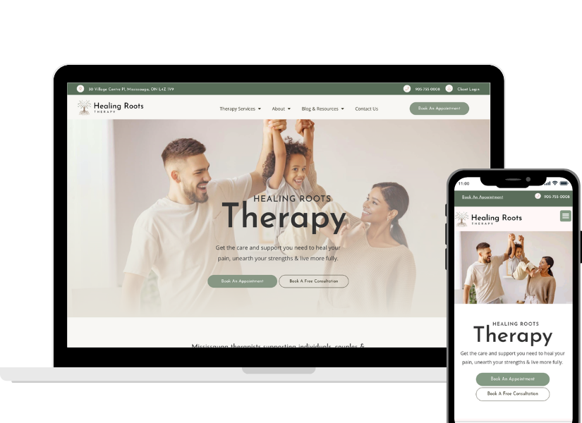
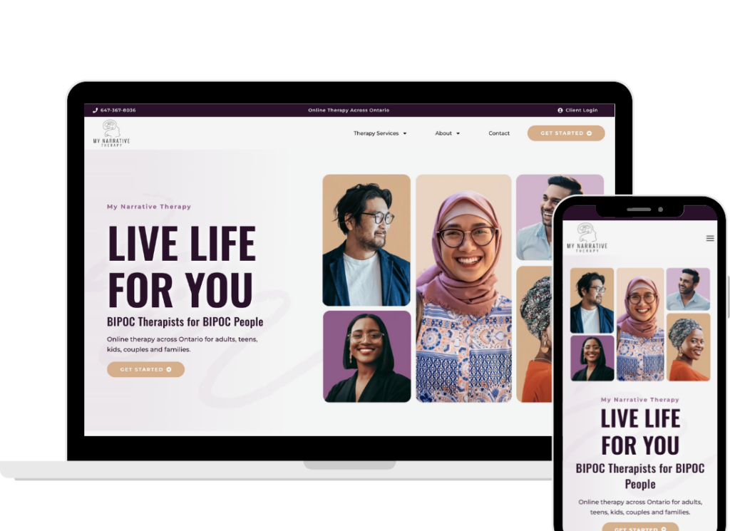
A sleek design. Gorgeous photos. A “Book Now” button front and center. Your therapy web design looks amazing. So why is your inbox still quiet?
Here’s the hard truth: A beautiful therapy website that lacks clarity is like a fancy front door that leads nowhere. It looks inviting, but your ideal client gets lost before they ever make it to your couch.
At Master Your Message, we work with therapists and coaches who are doing everything “right” but still struggling to get results. And 9 times out of 10? The issue isn’t your design. It’s your message. And more specifically, it’s why your therapy website isn’t converting.
In this post, we’re pulling back the curtain on the most common clarity issues we find during website audits and giving you simple, actionable tips to fix them.
Key Takeaways
- A beautiful website is useless without a clear, client-focused message.
- Confusing navigation and inconsistent calls-to-action (CTAs) create friction.
- Your homepage should guide visitors toward one specific next step.
- Jargon, broken links, and vague headlines kill trust and therapy website conversions..
- Clarity isn’t just about words; it’s about creating a seamless flow.
The Clarity Gap: Why Clients Aren't Reaching Out
Your website might check every box in terms of design, but if your message is confusing, inconsistent, or overloaded with therapist-speak, your dream clients will bounce.
Imagine this. A potential client lands on your homepage. They’re already overwhelmed. They’ve finally worked up the courage to reach out for help. But now they have to decipher:
- Should I click “Book Now,” “Schedule a Session,” or “Contact Me”?
- What kind of therapy do they offer?
- Am I even the right fit?
- What’s the difference between this therapist and the five others I just Googled?
If they have to think too hard about what to do next, they’ll click away. If they have to think too hard about what to do next, they’ll click away. This is often the turning point for why your therapy website isn’t converting.
Action Step: Audit Your Calls-to-Action
Pick one primary call-to-action and make it consistent across your entire website. Whether it’s “Book a Free Consultation” or “Schedule Now,” that button should be obvious, accessible, and repeated often. (Check out our Therapy Website Checklist to help with this.)
Common Website Messaging Mistakes (And How to Fix Them)
1. Inconsistent Buttons and CTAs
If your homepage says “Book Now,” your About page says “Schedule a Session,” and your Services page says “Contact Me,” you’re creating confusion.
Fix: Pick a single CTA. Make sure every page drives toward that same action. Repetition builds trust and makes the path clear. Consistency is key for boosting therapy website conversions.
2. Jargon That Alienates Clients
You might think phrases like “trauma-informed” or “somatic integration” showcase your expertise, but if your clients don’t understand what those words mean, they won’t stick around to learn more.
Fix: Talk like a human. Swap clinical language for compassionate, plainspoken text that answers your client’s internal question: “Can you help someone like me?”
3. Broken or Unclear Navigation
Visitors shouldn’t have to guess where to go. A confusing menu or broken links kill momentum and trust.
Fix: Stick to simple, intuitive labels: Home, About, Services, Contact. Test your links regularly and make sure every page has a clear “next step.”
4. Copy That Focuses on You, Not Your Client
“I am passionate about helping people” is not a differentiator. Your clients need to see themselves in your words.
Fix: Start your homepage with client-centered language. Speak to their pain points, and position yourself as the guide, not the hero. his shift can dramatically improve therapy website conversions.
The SFrom Pretty to Profitable: How Clarity Converts
A great website isn’t just pretty. It’s purposeful.
It anticipates your clients’ questions. It reduces friction. It builds trust. It makes it easy to take the next step.
When your website message is clear, your flow makes sense, and your design supports (not distracts from) your goal, that’s when the magic happens.
Instead of being a digital brochure, your website becomes a conversion machine.
Here’s how you know your website has clarity:
- Your CTA is the same on every page.
- Your copy sounds like you (and like a human).
- Your homepage makes it crystal clear who you help and how.
- Your clients don’t need a psychology degree to understand what you offer.
- Your design leads the eye naturally toward your primary goal.
Real Talk: Is It Time for a Website Audit?
If your website looks polished but your schedule is still patchy, it might be time for a fresh set of eyes.
At Master Your Message, our team specializes in strategy, messaging, and websites built for conversion. Whether you need a total overhaul or a few quick wins, we’re here to help you stop spinning your wheels and start seeing results.
Check out our More Profitable Therapist Blueprint for a done-with-you process that includes clear messaging, strategic website design, and the tech setup you need to get found on Google.
Ready to turn your website into your best referral source? Book a free consult today. Let’s get your message clear and your inbox full.