Branding can feel like a mysterious world filled with hex codes, font pairings, and people throwing around phrases like “brand identity” as if that clears things up. You know you want your business to look professional, trustworthy, and maybe even a little scroll-stopping. But when it comes to creating a consistent look and feel across your website, social media, and marketing materials, things start to get messy.
One day you’re using a calming blue, the next you grab a bright pink because it looked fun. Your Instagram posts are using one font, your website another, and your business cards? Let’s just say they belong to a different universe.
Here’s the thing: when your brand visuals are inconsistent, people notice. And not in a good way. Instead of looking polished and professional, your brand can come across as confusing or even untrustworthy. That’s where a brand style guide comes in.
Think of it as your brand’s rulebook. A guide that keeps everything looking cohesive, on-message, and unmistakably you.
In this blog, we’ll break down what a brand style guide is, why it’s essential (especially if you’re a therapist, coach, or small business owner), and how it can save you time, money, and a whole lot of frustration.
Key Takeaways
- A brand style guide defines the visual rules for your brand, including fonts, colours, and iconography.
- Consistency builds trust and recognition. If your brand looks different everywhere, people will not remember or trust you.
- Your style guide makes collaboration easier. Whether you hire a designer, social media manager, or VA, they will all have one source of truth.
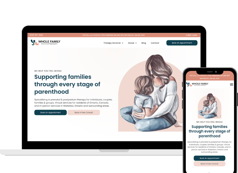
- For therapists and coaches, a polished brand presence helps potential clients feel safe, confident, and ready to book.
- Done right, your brand guide saves you time, reduces decision fatigue, and strengthens every single piece of your marketing.
What Is a Brand Style Guide (and How It Shapes Your Brand Identity)
A brand style guide is a document that outlines the visual rules for your brand.
It is not about telling you what your brand stands for (that is your strategy and mission), but it shows you how your brand shows up visually.
At minimum, a brand style guide covers:
- Fonts (Typography): Which fonts you use for headers, body text, and accents.
- Colours: Your brand palette, including primary and secondary colours, plus exact hex codes.
- Iconography / Style: The type of graphics, illustrations, or icons that feel “on brand.”
Other elements of branding can go beyond the visual style guide itself. This includes things like your tone of voice, the words you intentionally use (and the ones you avoid), and the overall style of your imagery. While we don’t put these into the brand guide we deliver (they get incorporated into the end website product), they’re still essential parts of how your business is experienced and remembered.
Why a Brand Style Guide Matters (Especially for Small Businesses)
1. Consistency Builds Trust
Imagine walking into Starbucks and finding five different logos on their cups, menus in ten different fonts, and green that sometimes looked lime, sometimes forest. Would you trust them to get your latte right?
Clients feel the same about your business. When your website, Instagram, and marketing materials look cohesive, people think: “This brand has it together.” And trust is everything in therapy, coaching, or service-based work.
2. Recognition Creates Memorability
You want people to think of you when they see your colors or style. If you’re a coach with a bold yellow brand, or a therapist who uses calming pastels, those visuals become shorthand for your business.
The more consistent you are, the faster people will recognize your brand, even before they read your name.
3. Saves You Time (and Sanity)
Without a style guide, every Canva design session turns into a rabbit hole: “Should I use teal or navy today? Bold font or script font? Maybe pink?” Hours later, you’ve got decision fatigue and nothing posted.
With a style guide, you just follow the rules. Done.
4. Makes Outsourcing Easy
At some point, you will want help. Maybe you hire a VA to make social posts or it’ll be time to have business cards made for an upcoming networking event.
With one? You hand it over, and voilà: they know exactly how to design on-brand.
5. Professionalism That Converts
A Real-World Example: Starbucks
Think about Starbucks. Whether you’re in Toronto, Tokyo, or Paris, you know exactly what to expect before you walk in the door. Their green logo is always the same shade. Their fonts are consistent across menus, ads, and coffee cups. Their imagery (warm, inviting, lifestyle-focused) never strays too far from that “third place” vibe they’ve built.
That consistency is not an accident. It’s the result of a brand style guide that ensures everything looks and feels like Starbucks, no matter who is creating the materials or where they are in the world.
This is exactly why a brand style guide matters for small businesses and therapists too. You may not have a global coffee chain, but you do want people to instantly recognize your brand across your website, social media, and marketing. Consistency builds trust, and trust leads to bookings.
How to Create a Brand Style Guide: Fonts, Colours, and More
1. Fonts (Typography)
Fonts are more than just letters. They communicate personality.
- Sans-serif fonts (like Poppins or Lato) feel modern, clean, and approachable.
- Serif fonts (like Lora or Merriweather) feel traditional, sophisticated, and trustworthy.
- Script fonts (like a handwritten style) can add flair but should be used sparingly.
Your guide should define:
- Heading font
- Body text font
- Accent font (if any)
Pro Tip: Limit yourself to 2–3 fonts max. Too many looks messy.
2. Colours
Colour psychology is real. Blues feel calm and safe (hello therapists), yellows feel energetic, and greens signal growth.
Your style guide should include:
- Primary colours (your main brand shades)
- Secondary colours (to support or add variety)
- Hex codes or RGB values (so every designer gets the exact match)
Consistency here keeps your brand recognizable.
3. Iconography and Style
This includes your overall “look.” Do you use minimalist icons? Hand-drawn doodles? Bold line graphics?
Having a consistent icon style keeps your website and social graphics cohesive. Mixing flat icons with detailed 3D illustrations makes things feel mismatched.
Other Key Branding Elements: Imagery and Brand Voice
Imagery
Your images set the tone for your business. Do you use bright, airy photos or moodier, dramatic ones? Should stock photos show diverse clients and real-life scenarios? Are you aiming for candid, natural moments or polished, professional shots?
Having a general style and feel for your imagery ensures everything from your website to your Instagram posts looks like it belongs to the same brand.
Brand Voice
Tone of voice is a foundational part of any brand. Whether you sound empathetic and warm, or bold and direct, your voice needs to be consistent. This is what makes your messaging resonate and helps potential clients connect with you.
FAQs (Because You’re Probably Wondering)
Do I really need a brand style guide if I am just starting out?
Can I make a brand style guide myself?
Can I change my style guide later?
Conclusion:
A brand style guide is more than a design exercise; it’s a business tool. It ensures that every time someone interacts with your business, whether it’s through your website, an Instagram post, or even a printed flyer, they’re experiencing the same cohesive, trustworthy brand.
Without a guide, your brand risks looking scattered, inconsistent, and forgettable. With one, you save time, reduce decision fatigue, and make it easier to collaborate with anyone you bring onto your team. Most importantly, you build the kind of consistency that creates trust and recognition.
At Master Your Message, we believe in doing it once and doing it right. That’s why every website project we deliver comes with a custom brand style guide tailored to your business.
If you’re ready to create a brand that feels consistent, professional, and unforgettable, let’s talk.