Your homepage is the first impression most people will ever have of your private practice. Long before a client sits down in your office or logs into a virtual session, they’re sitting at their laptop or scrolling on their phone, deciding whether you’re the right therapist for them.
Here’s the hard truth we’ve learned after completing over 300 therapy website audits: many therapy websites don’t make that first impression count. Headlines that don’t say anything. Missing location details. Stock images that lack emotion. Walls of text that overwhelm instead of connect. Or worse, homepages that are missing the basic information people need to make a decision.
Your homepage doesn’t have to be complicated, but it does need to be intentional. Think of it as your practice’s book jacket. It’s not the entire story, but it has to be compelling enough for someone to keep reading. Your homepage is also an invitation into the rest of your website. Some visitors will scroll your homepage and convert right away. Others will want to explore further by reading your About page, looking at your services in detail, or checking out your contact page before they reach out. A strong homepage welcomes both types of clients and guides them where they need to go next.
In this article, we’ll walk you through the words and sections that every therapy website homepage needs, with a focus on clarity, compassion, and connection. We’ll also tie in the StoryBrand framework, which is all about guiding your clients through a clear journey from landing on your site to reaching out for help.
Why StoryBrand Matters for Therapists (Explained Simply)
We know not everyone is familiar with marketing frameworks, so here’s StoryBrand in a nutshell:
StoryBrand is based on the idea that your client is the hero of the story, and you are the guide. Too often, websites make the therapist the “main character.” Pages get filled with credentials, therapeutic philosophy, or long backstories about the therapist. But the truth is, clients are coming to your website because they want help with their story, not yours.
A StoryBrand-aligned homepage walks clients through this journey:
- Clarity: Immediately show them they’re in the right place.
- Empathy: Help them feel understood and supported.
- Authority: Subtly build trust by showing you can help.
- A Clear Path Forward: Tell them exactly what step to take next.
It’s not about flashy design or cramming in everything you do. It’s about structuring the words and sections on your homepage in a way that makes potential clients feel safe, understood, and ready to take action.
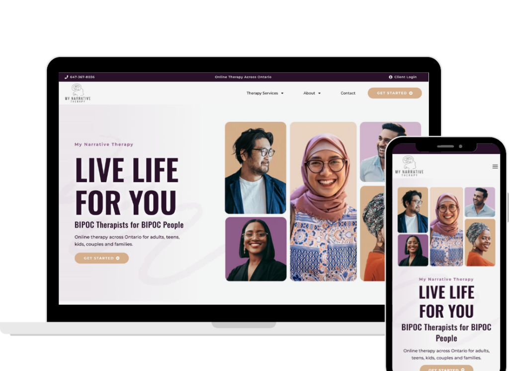
Above the Fold: Hook, Clarity, and Connection
The “above the fold” section is what people see without scrolling. It’s the most important part of your homepage. If this section doesn’t connect, most visitors won’t stick around.
Here’s what it should include:
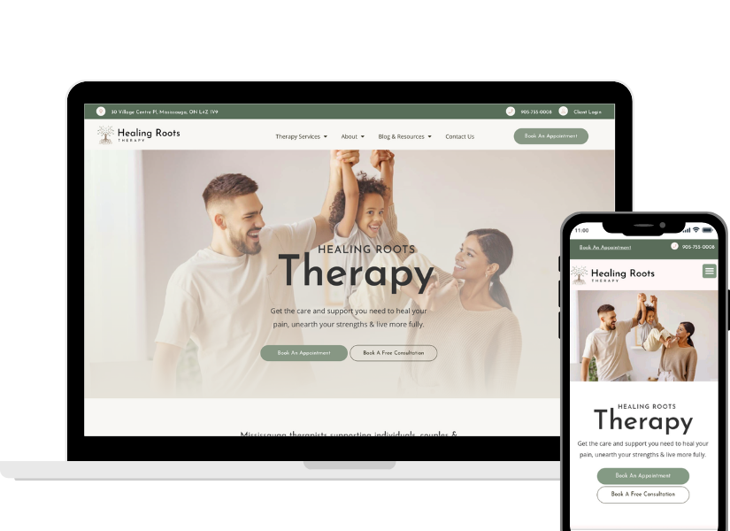
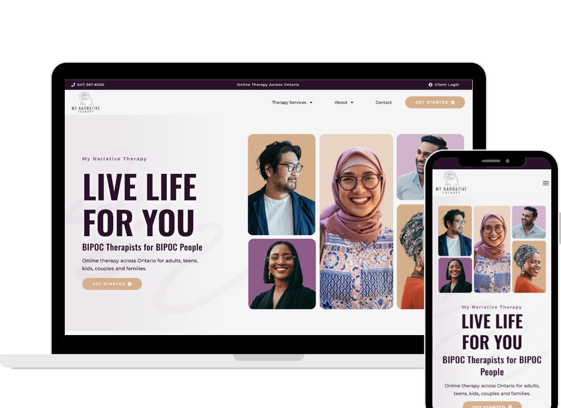
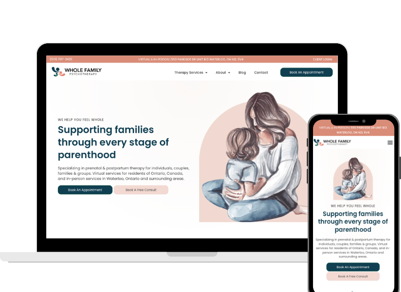
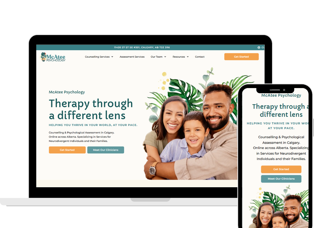
1. Aspirational Headline
Your headline should paint a picture of the future your client wants, not just describe what you do. This is where you make an emotional connection.
Instead of this:
“Welcome to Harmony Counselling Center.”
Try this:
“Feel calmer, more connected, and more in control of your life.”
This kind of aspirational language immediately shows clients what’s possible with therapy. It acknowledges their struggles without dwelling on the negative, and it gives them hope.
2. Subheadline With Location and Audience
Directly under the headline, include your location and who you serve. This is essential for two reasons:
- Clarity for clients: People want to know right away if you’re available to them. If you’re only licensed in Alberta, and someone in Ontario stumbles across your site, they should know immediately whether you’re a fit.
- SEO for visibility: Search engines rely on location keywords to understand where you practice. Without it, you’re less likely to show up when someone searches “therapy in Calgary” or “anxiety counselling Toronto.”
3. Authentic Image That Speaks to Your Audience
Images are emotional triggers. The wrong image can push someone away; the right image can help them feel seen and safe.
One of the biggest issues we see in audits is mismatched stock photography: beaches when you’re in New York, mountain ranges for a practice in downtown Toronto, or generic posed shots that feel impersonal.
Instead, choose imagery that reflects your audience and the outcomes they’re hoping for:
- A family photo if you work with parents and kids.
- A couple walking together if you focus on relationships.
- Calm, hopeful imagery that matches your location and climate.
Remember, the goal is not perfection, it’s authenticity. The image should help clients feel like, “These are my people. This is my place.”
4. Primary Call-to-Action (CTA)
Never assume people know what to do next. Make it obvious with a clear, visible button.
Examples:
- “Book a Free Consultation”
- “Schedule an Appointment”
- “Get Started”
Your CTA should use action-oriented language, not vague phrases like “Learn More.” Place it in a button that contrasts with your background so it stands out.
Pain Panel: Helping Clients Feel Understood
Before diving into services, your homepage should include a short section that acknowledges what your clients are going through. This is often called a “pain panel.” It’s not about making things heavy or dramatic; it’s about showing empathy.
When someone visits your site, they want to know two things right away: Do you understand what I’m dealing with? And can you help?
This section might look like a short paragraph or a few lines that describe the struggles your clients face in their own words:
- “You’ve been feeling overwhelmed by anxiety, no matter how hard you try to push through.”
- “Lately, it feels like your relationship is more about conflict than connection.”
- “You’re tired of pretending everything is fine while you feel stuck inside.”
This is the StoryBrand empathy piece, helping visitors feel understood and supported. You’re not listing every possible condition. You’re showing them that you “get it” and that they’re in the right place.
Services and Who You Help
Once you’ve connected with their struggles, it’s time to show how you can help.
This section combines two essential elements (your services and who you help) into one clear overview. Clients don’t think in terms of categories; they think in terms of whether you can meet their needs.
How to structure it:
- Headline: “Therapy Services in Calgary”
- Intro sentence: “We help adults, teens, and couples navigate challenges like anxiety, grief, relationship struggles, and major life transitions.”
- Service blocks: Individual Therapy, Couples Therapy, Teen Therapy, etc., each with a short description written in client-friendly language.
This gives visitors confidence that you understand their challenges and can provide the right kind of support. It also builds SEO naturally by including both service types and client struggles.
About the Clinic and Your Team (Building Connection)
After clients see that you can help with their struggles, they want to know who you are. This is where you introduce your clinic and, if applicable, your team.
Think of this section as a quick handshake: warm, approachable, and reassuring. It doesn’t need to be long, but it should give people a sense of the humans behind the practice.
What to include:
- A photo of you (solo practice) or a few featured team members (group practice).
- A short introduction that explains why your clinic exists and the kind of support you provide.
- If you have a team, highlight some or all of your therapists, depending on your layout.
Tips:
- Keep this section simple if you’re DIYing your therapy website (too many bios can get overwhelming).
- Make sure faces are visible. From our audits, one of the most consistent gaps we see is faceless websites that feel impersonal. People connect with people, not logos.
This section is where trust starts to grow. A potential client can now imagine themselves talking to you (or to one of your team members), and that makes reaching out feel less intimidating.
Contact Section
Here’s another common gap we see: missing or hard-to-find contact info. Some websites only have a contact form buried in the footer, others hide email addresses or forget to make phone numbers clickable on mobile.
Don’t make people hunt for the basics. Your homepage should have a dedicated contact section with:
- Phone number (clickable)
- Email or simple form
- Location (if you have a physical office)
This is especially important for clients who may already feel anxious about reaching out. The easier you make it, the more likely they’ll follow through.
Guiding Visitors From Start to Finish
When all of these sections come together, your homepage tells a story:
- Headline inspires hope.
- Subheadline clarifies who you serve and where.
- Image creates connection.
- CTA shows them the way forward.
- Pain panel shows empathy and proves you understand.
- Services + who you help reassure them you can meet their needs.
- About the clinic and your team humanize your practice and show the people behind it.
- Contact info makes reaching out simple.
The Bottom Line
Your homepage is not just decoration. It’s a tool to welcome, reassure, and guide potential clients. And it only needs a few clear, intentional sections to work.
By including an aspirational headline, clear subheadline with location, authentic images, a pain panel, a blended services and focus section, a short clinic + team intro, and a contact section, your homepage can do its job: help potential clients feel seen, safe, and ready to take the next step.
After completing over 300 audits, we can say with confidence that these are the sections that make the difference between a homepage that just looks nice and one that actually works.
Want help making your homepage work harder? Schedule a free discovery call and we’ll show you exactly what’s missing and how to fix it.