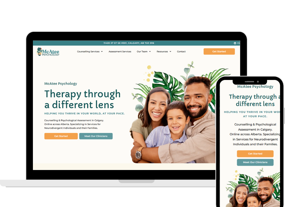
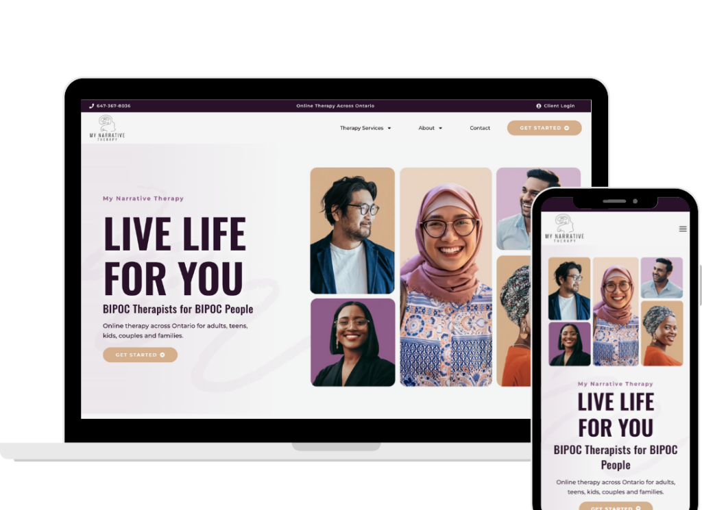
You launched your private practice website with so much hope. You spent hours (maybe even days) picking the right photos, fine-tuning your bio, and making sure it didn’t look outdated. So why is it still not bringing in clients?
If your website feels more like a static brochure, something nice to look at but not moving people to action, you’re not alone. Many therapists come to us with the same frustration: “My site is live, but it’s just not working.”
The good news? It’s not about working harder. It’s about getting strategic.
Key Takeaways
- Client-focused messaging beats credential-dumping every time
- Your website needs a single, clear journey from pain to solution
- Clinical language is okay, as long as it matches your audience’s level
- Pretty design without strategy is like a map with no destination
- Specific language connects. Vague messaging repels. If you are speaking to everyone, you are speaking to no one
1. It’s Heavily Clinician-Centered, Not Client-Focused
We know you’ve worked hard to earn your degrees, certifications, and licenses. And yes, things like CBT, EMDR, or psychodynamic therapy do matter.
In fact, in 2025, many prospective clients really are searching for therapists who are trained in specific modalities. They may want EMDR because they have heard of its effectiveness, or they may be looking for CBT because it has been recommended to them. For those clients, your training and credentials are reassuring and build trust.
But not every client is searching by modality. Many arrive thinking in terms of their feelings: “I’m anxious all the time,” “I can’t sleep,” or “I feel stuck.” If your homepage focuses only on technical details or your list of trainings, you risk missing those visitors who are looking to feel understood first.
The most effective approach is balance: speak to both audiences. Highlight your training and credentials in a way that shows authority, while also using language that connects to a client’s emotional world. This way, someone who cares about modalities feels confident in your expertise, and someone who is searching from a place of struggle feels seen and understood.
What to do instead:
- Balance emotional language with references to your credentials
- Start with an empathetic headline that mirrors what they’re feeling
- Use a mix of professional validation and human connection
- Save your longer list of certifications for your About/bio page
- Use “you” to center your client in the story
When both kinds of clients feel seen (those who are modality-focused and those who are feelings-focused)they’ll stay to learn more.
2. There’s No Clear Path to Take Action
Therapists often say, “I have a button that says ‘Contact Me.’ Isn’t that enough?”
Unfortunately, no.
Your website isn’t just a place to display your information. It should actively guide your visitor toward the next step. A lone button buried at the bottom of the page isn’t going to do the trick.
Think of your site like a conversation. If someone says, “This sounds great, what now?” and your site doesn’t give them a confident answer, they’re likely to leave confused or distracted.
What to do instead:
- Place a clear, bold call-to-action (CTA) near the top of every page
- Repeat that CTA in key spots (not just once!)
- Use directional cues like arrows or bold text to guide action
- Tell them what happens next: “Book a free consult”
When you make it easy and inviting to take the next step, people are more likely to do it.
3. The Messaging Is Too Generic (or Too Advanced)
There’s a sweet spot between “overly clinical” and “so vague it hurts.”
If your website says:
- “I provide evidence-based interventions to support emotional regulation”
…your client might think: Wait, what does that mean? Do you help with anxiety?
On the flip side, messaging like:
- “I help you live your best life!”
…may sound warm but lacks clarity or direction. It’s like giving someone a hug while they’re still drowning.
Your words should educate, connect, and reassure, all at once. This is where knowing your audience deeply matters. Are they brand-new to therapy? Have they worked with someone before? Are they analytical, emotional, overwhelmed?
What to do instead:
- Use everyday, relatable language that feels grounded
- Speak to the problems your client is aware of and actively dealing with
- Match your tone to your audience’s emotional and clinical awareness
- Include both symptoms and the impact: “You can’t sleep, and it’s starting to affect your work”
Clarity builds trust. Vague or overly complex copy just builds friction.
4. There’s No Clear Story or Path (AKA Messaging Chaos)
Your website isn’t just a collection of pages, it should tell a story. And not just any story: your client’s story.
If someone lands on your homepage and can’t figure out who you help, how you help them, or what to do next, they’re gone. This happens more often than you’d think, especially when therapists try to fit too many services or messages onto one page.
This is where frameworks like StoryBrand come in. At MYM, we build every site with this narrative flow in mind:
Problem -> Solution -> Results -> Action
This structure helps your audience see themselves in the journey. They arrive on your site feeling stuck. Your copy acknowledges that pain, introduces you as a guide, shows them what life could look like after therapy, and then invites them to act.
What to do instead:
- Identify your ideal client’s core pain point right away
- Walk them through how therapy with you solves that problem
- End with a powerful, repeated CTA to book
Every part of your website should be moving your reader forward, not in circles.
5. It’s Not Speaking to a Specific Person
We get it, you want to help everyone. And you probably can help a wide range of people.
But if your website says something like:
- “I help people live more fulfilling lives”
…you’re not going to connect with anyone in particular.
Generic messaging feels safe, but it also feels invisible.
Your ideal clients want to feel like you wrote the site just for them. That means naming their struggles, describing their hopes, and using the exact language they’d use if they were talking to a friend.
What to do instead:
- Speak directly to the client you love working with most
- Include examples of common struggles they face in real-world language
- Get granular: age group, life stage, identity, relationship status, even location
- Use second-person voice (“you,” not “clients” or “people”)
That doesn’t mean you’re excluding people, it means you’re creating a message that lands with the people you most want to attract. And those are the ones who are more likely to take action.
Conclusion: Your Website Should Work As Hard As You Do
Your website is often a client’s first session with you. If it’s confusing, vague, or disconnected from what they actually need, they’ll leave before you ever get the chance to help.
But when your message is clear, your design is strategic, and your story speaks directly to the people you want to serve? That’s when your website becomes more than a placeholder, it becomes a powerful tool for growth.
Let’s build a website you’re proud to share.
Book a free discovery call today to talk about how we can bring clarity, strategy, and connection to your online presence.
