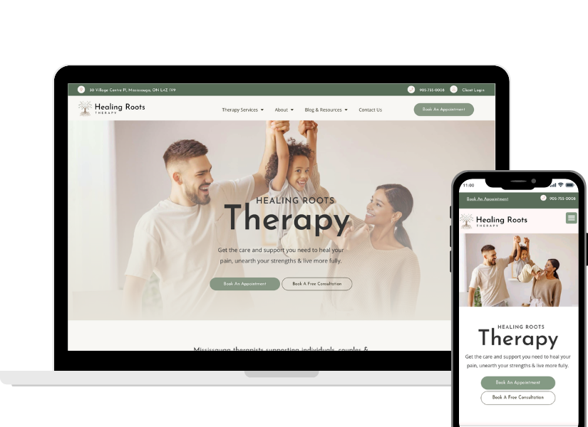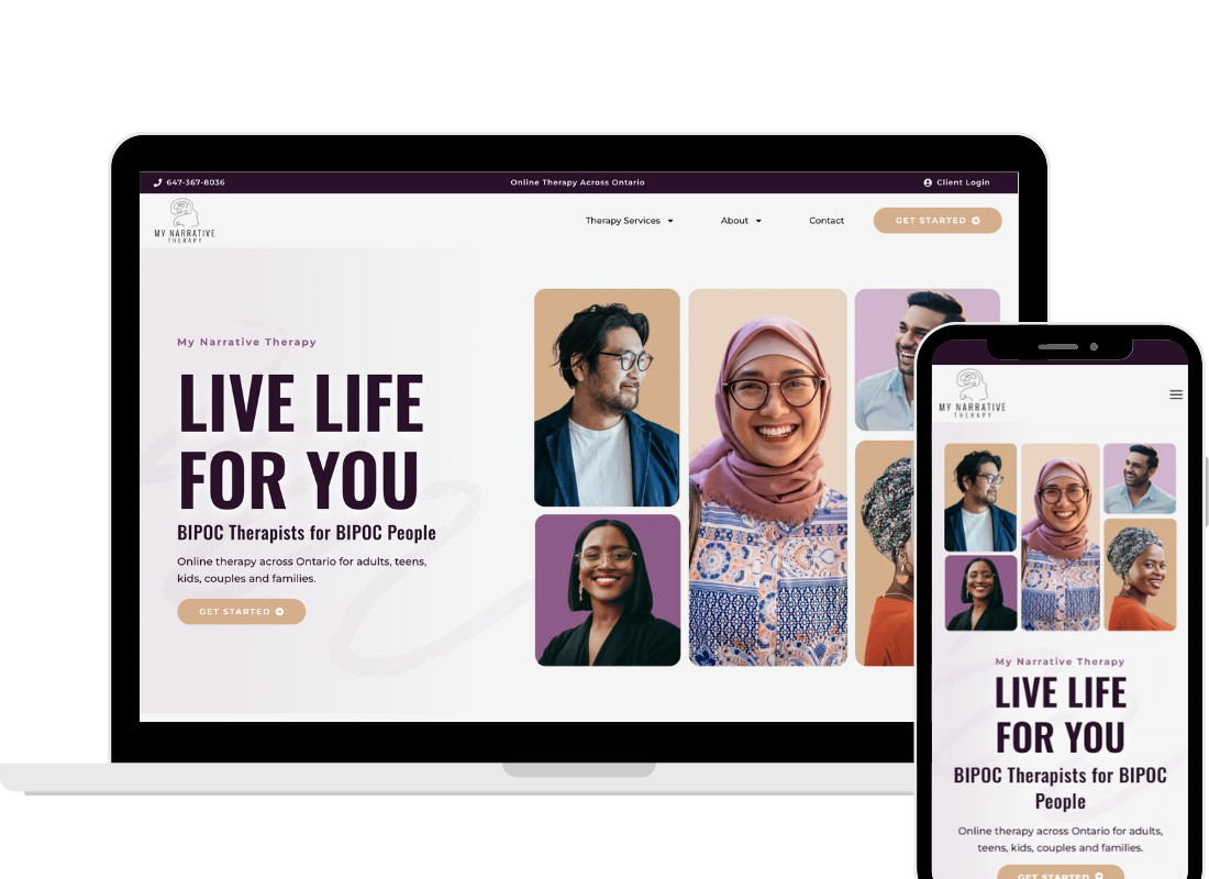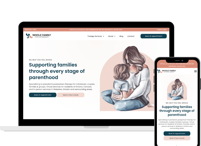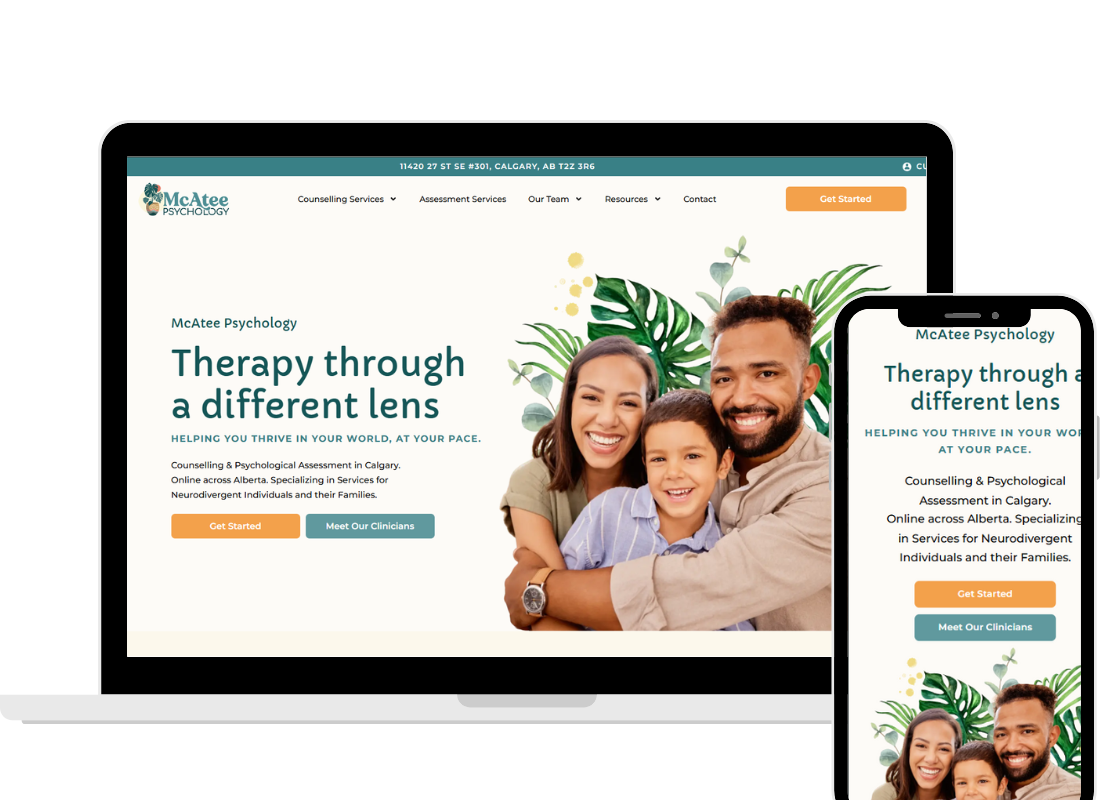
Your therapy website homepage is more than words on a screen. Yes, the copy and structure matter (and if you haven’t yet, check out our article on the words and sections to include). But here’s the truth: the best copy in the world won’t work if your homepage doesn’t function well.
We’ve completed over 300 therapy website audits, and we’ve seen the same technical and design problems again and again: slow load times, confusing navigation, missing SEO basics, calls-to-action that blend into the background. These small but important issues quietly stop potential clients from ever contacting you.
The good news? You don’t need to be a developer to fix most of these. With a few adjustments, your homepage can work beautifully for clients and for search engines. Think of your private practice website homepage like the frame of a house. The paint colours and furniture (your words and images) matter, but without a strong frame, everything falls apart.
Here’s our checklist for the design and technical must-haves every therapy homepage needs.
Speed and Performance on a Therapy Website Homepage
Imagine a potential client, already nervous about reaching out, waiting three… four… five seconds for your homepage to load. Most people won’t wait. They’ll click the back button and look for another therapist.
Speed is one of the most important factors on your website.
Here’s how to keep your therapy website homepage fast without needing to know tech jargon:
- Shrink your images. Huge image files are one of the biggest reasons therapy websites load slowly. Before uploading a photo, use a free online tool to make the file size smaller without losing quality.
- Use an image optimizer plugin. If you’re on WordPress, you can install a plugin that automatically compresses images as you upload them. Once set up, it does the work for you.
- Turn on caching. Think of caching like giving your site a short-term memory. Instead of rebuilding every page from scratch every time someone visits, it remembers the common parts and loads them faster. Most website hosts or plugins make this as simple as flipping a switch.
- Avoid heavy extras. A homepage with autoplay videos, giant slideshows, or complex animations may look impressive, but they slow things down. A simpler homepage almost always performs better.
A fast homepage does two things for you:
- It keeps people on your site long enough to actually learn about your services.
- It signals to Google that your counselling website is high-quality, which can help you show up higher in search results.
Mobile Optimization
Here’s something many therapists don’t realize: the majority of your potential clients are probably seeing your site on a phone, not a computer. Over 60% of all global website traffic in 2025 came from mobile devices.
If your therapy website looks good on a laptop but awkward on a phone, you’re losing more than half your audience.
What mobile optimization looks like in practice:
- Readable text. Your body copy should be large enough to read comfortably on a phone without zooming in. If someone has to squint, they’ll leave.
- No horizontal scroll. Everything should fit inside the width of the screen. If someone has to swipe sideways to read, your design isn’t mobile-friendly.
- Layouts that adjust. What looks nice side-by-side on desktop should stack neatly on mobile. Good website builders make it possible to control how each section looks across different devices.
- Buttons and menus that are easy to tap. Think thumb-friendly. Nobody wants to fight with tiny buttons.
- Tap-to-call. Your phone number should be clickable so someone can call you with one tap.
When we run audits, one of the most common gaps we see is therapists who’ve only ever looked at their website on their laptop. Always pull up your homepage on your phone and scroll through. Better yet, check it on more than one device. What looks fine on your screen might look messy somewhere else.
Clear Navigation
Your homepage is like a map. Its job is to guide people into the rest of your website. But if the navigation isn’t clear, people get lost—and when people get lost, they leave.
One issue we see often is inconsistent clickability. For example, the “Services” tab in the top menu might open a page, but “About” only opens a drop-down menu and doesn’t go anywhere if you click it. This feels confusing and unprofessional. Every main menu item should work the same way: clickable and leading somewhere.
Best practices for navigation:
- Keep the main menu simple: Home, About, Services, Contact.
- If you have multiple specialties, group them under Services instead of cramming them into the top menu.
- Always link your logo back to the therapy website homepage. People expect this.
Navigation should never make a visitor pause and wonder, “Where do I click?” The easier you make it, the longer people will stay.
SEO Foundations
Search Engine Optimization (SEO) may sound intimidating, but the basics are simple. SEO is how Google knows what you do, where you do it, and who you help. Without it, your therapy website homepage is basically invisible.
The must-haves for every therapy homepage:
- A strong H1 heading. This is the main title Google looks at. Include your service and location. Example: “Therapy in Calgary for Adults and Couples.”
- Clear subheadings (H2s). These break up your content and tell Google (and your readers) what each section is about. Example: Services, About, Contact.
- Meta description. This is the short blurb that shows up in Google search results. Write it like you’re speaking directly to your ideal client. Example: “Counselling for anxiety, relationships, and life transitions in Toronto. Online therapy available across Ontario.”
- Keywords woven naturally. Think about what your clients would actually type into Google: “anxiety therapy Toronto” or “couples counselling Calgary.” Write the way they search.
- Alt text for images. When you upload a photo, add a simple description like “smiling couple walking in a park.” It’s another way for Google to understand your site.
These basics make your homepage more than a brochure. They make it discoverable.
Call-to-Action (CTA) Design and Language
Your call-to-action is the bridge between someone reading your homepage and becoming a client. If it isn’t obvious or clear, you risk losing people who were ready to take the next step.
Design principles:
- Use a button, not just underlined text.
- Make the button stand out with a contrasting colour.
- Place one above the fold, then repeat throughout the homepage so people don’t have to scroll back up.
Language principles:
- Be direct, not clever. “Let’s Chat” might sound friendly, but it leaves people wondering—chat about what? A free consultation? A form? A newsletter? Clarity beats creativity here.
- Use action words that tell people exactly what to expect. Examples:
- “Book a Free Consultation”
- “Schedule Your Appointment”
- “Get Started Today”
When your CTAs look clear and say exactly what they mean, clients feel confident clicking.
Contact Section
Here’s another common gap we see: missing or hard-to-find contact info. Some websites only have a contact form buried in the footer, others hide email addresses or forget to make phone numbers clickable on mobile.
Don’t make people hunt for the basics. Your homepage should have a dedicated contact section with:
- Phone number (clickable)
- Email or simple form
- Location (if you have a physical office)
This is especially important for clients who may already feel anxious about reaching out. The easier you make it, the more likely they’ll follow through.
Footer Essentials
Too many websites end abruptly, with nothing but a copyright line at the bottom. That’s a missed opportunity. Your footer is the safety net at the end of your homepage.
What to include in your footer:
- Business name
- Location (and full address if you have a physical office)
- Phone number and email (both clickable)
- Links to your main pages (Home, About, Services, Contact)
- Privacy Policy and Terms pages
- Professional memberships or designations (RCC, Verified by Psychology Today, etc.)
- Copyright statement
Optional but helpful:
- Hours of operation
- Social media links
- Land acknowledgment (for Canadian practices)
If someone scrolls all the way down and still hasn’t clicked, the footer gives them everything they need to make contact
Visual Design and White Space in Therapy Website Design
A cluttered homepage is overwhelming. A clean homepage is calming. And when you’re a therapist, calming is the feeling you want people to have from the very first click.
How to keep your homepage design client-friendly:
- Don’t crowd the page with too many boxes, colours, or fonts. Give every section room to breathe.
- Stick to a simple colour palette that matches your brand.
- Use consistent fonts and sizes throughout the page.
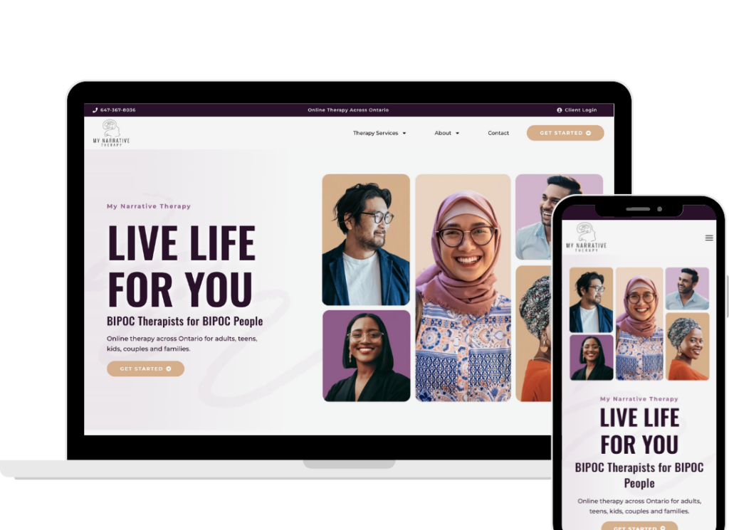
- Be intentional with images. One strong photo per section often works better than a collage.
Your homepage should feel like your office: welcoming, professional, and easy to settle into.
Words and Function Working Together
Your therapy website homepage needs both words and function to work. Without the right words, your therapy practice site won’t connect. Without good function, people won’t stay long enough to read.
- Words inspire, reassure, and guide.
- Function makes sure people can actually follow through.
When both are in place, your homepage feels effortless. Clients don’t just skim it. They move through it. And many will take the next step toward working with you.
The Bottom Line
A therapy homepage is part words, part design, and part technical foundation. If you ignore any one of those, the whole thing falls apart.
By focusing on function (speed, mobile optimization, clear navigation, SEO, strong CTAs, footer essentials, and simple design), you’re giving your homepage the structure it needs to do its job: welcome, reassure, and guide potential clients to take the next step.
After completing over 300 audits, we can say this with confidence: a homepage that works is one where words and function are in harmony.
Want to know if your homepage is pulling its weight? Schedule a free discovery call
and we’ll walk you through what’s working and what’s missing.